OnHand Sales Catalog
CATALOG DESIGN
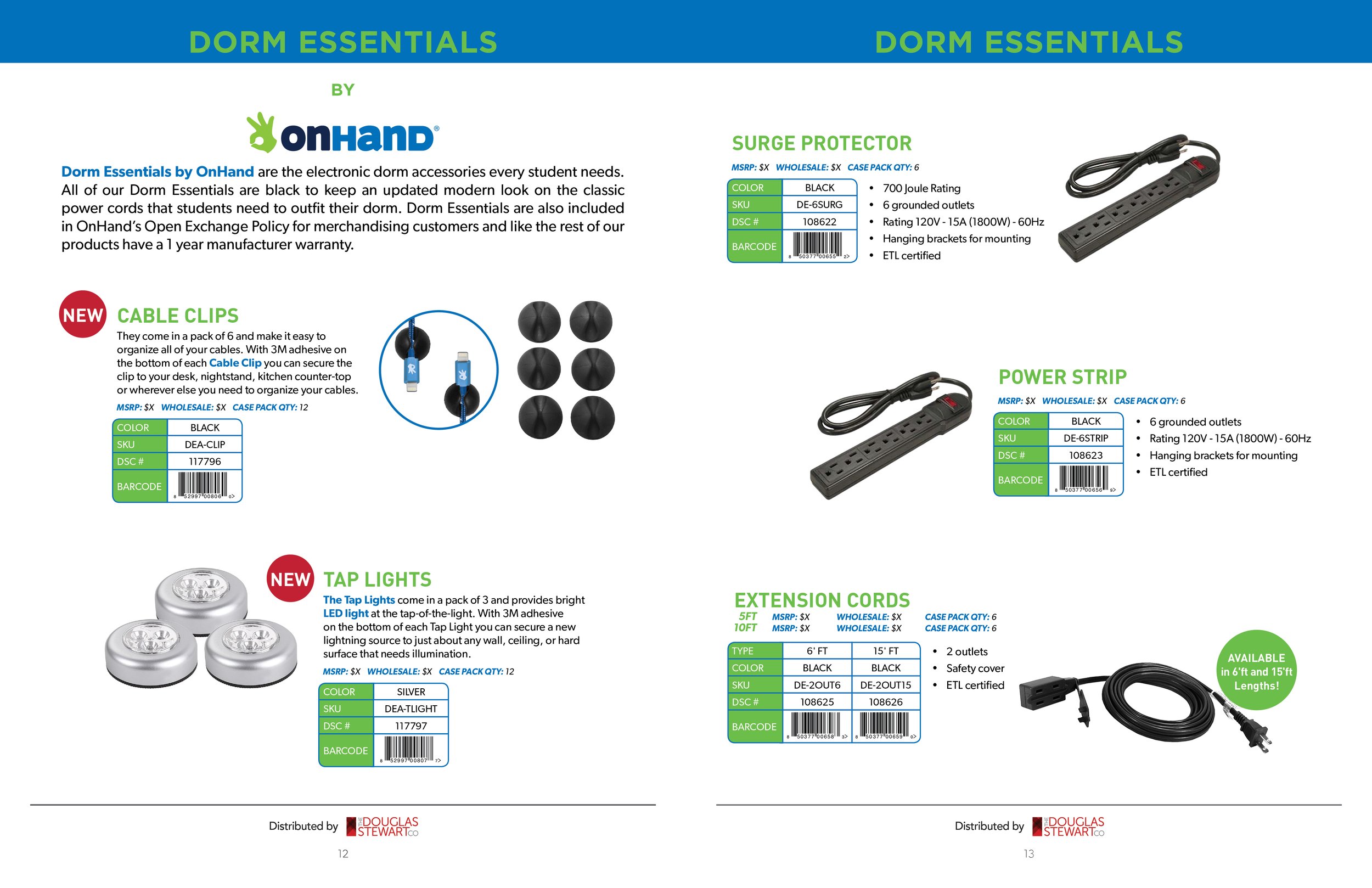
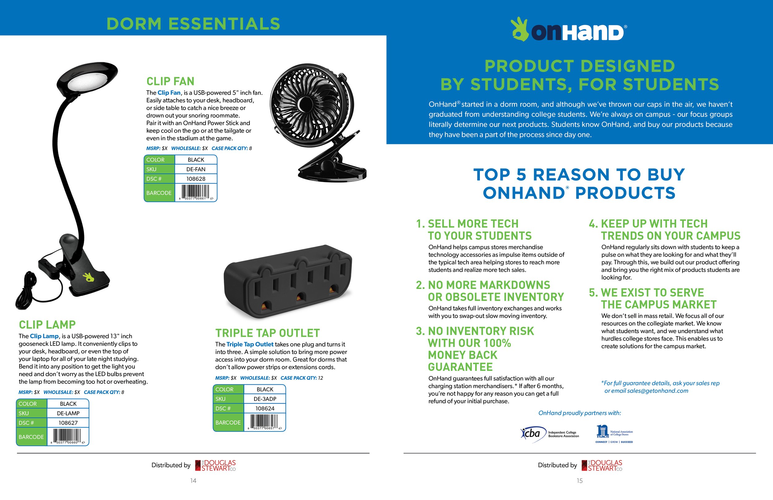
We loved working on this catalog for a small startup, who was making most of their sales through college student stores and hospital gift shops. We felt they needed something more creative in order to make cables more fun and interesting. We made it easy for sales reps to capture orders using our new layout system.
We also converted the pages for web use for sales reps to send a private link.
-
Used their existing product photography and mixed it with my 3D packaging to complete the catalogs’ product offering. We custom designed the packaging, illustration and layout of the new packaging and then we created virtual photo edited images of the packaging and created the rest of the packaging in order to have a consistent look.
-
When designing packaging for a catalog of products that don’t exist yet or products that are a little late to get samples of but still need to produce a catalog, make fake ones with a real one. Take a blank one even if it’s not perfect. Then clean it up in photoshop and mask out all the elements and drop in the new art, color and copy. Work from an illustrator flat layout and grab sections and drop them into the masked area and add shading.
-
Always create a naming system for the images based on the sku in the clients inventory database. This helps everyone stay on the same page quickly when you both reference a photo you might need or if something is missing.
-
Remember to double check and get approval for each item you do so your assets are all approved before dealing with complicated layouts or scenarios. Get the client to sign-off on the concept. It makes you head into it with full confidence you’re on the same page. Literally too.


